We know graphics and illustrations are flooding your timelines, but it’s important for your business to send a message to your clients that say you are here for them and are doing everything you can in light of the situation.

Blog
Surprisingly, there is a lot of debate as to what all your contact page should include. Think about it this way - everyone has them, needs them, and we guarantee you haven’t been paying attention to the strategy behind them. Contact pages are often the go-to page for a new visitor eager to learn more.
Have you ever received a file from your designer and were unable to open it? There is a good chance that the file type required a special software program in order to open it. I am going to breakdown a few common file types that you might come across while working with a designer and what they stand for and how to use them.
When I took my first typography class in college, I had no idea that there was a difference between a typeface and a font. Turns out, many people don’t know there is a difference. But it’s actually quite interesting, and is an essential piece of knowledge for a designer.
Here’s the basic idea:
A typeface is a family of fonts – let’s use Gotham for example. Within the family of Gotham lies its fonts distinguished by weight and style, such as Gotham Book, Gotham Light, Gotham Thin Italic, Gotham Narrow Light, etc. In traditional print times, the classification of a font also depended on its point size, since printing presses had to buy type plates. Now, the term font doesn’t necessarily include point size.
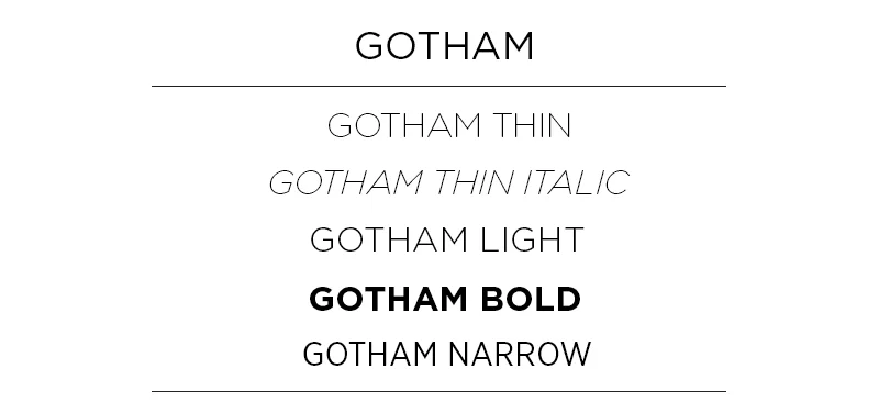
Let’s break it down:
Typeface: Gotham
Font: Gotham Narrow Light
Typeface: Chronicle Display
Font: Chronicle Display Light Italic
Today, many people use the terms typeface and font synonymously, but as a designer, knowing the difference is a huge help. For brands, it can be important to signify a specific font as representative of your brand instead of an entire typeface. For example, depending on the company, it may not be on-brand to use both a thin and a black font within a typeface. If you’re working with a designer, it will help them in creating on-brand material if you make this distinction!