
The holidays are here once again, and we know exactly what to give! Let us help you with your last minute shopping with our holiday gift guide! Find the perfect gifts for your friends and family at the finest businesses in Atlanta!

Blog
When I took my first typography class in college, I had no idea that there was a difference between a typeface and a font. Turns out, many people don’t know there is a difference. But it’s actually quite interesting, and is an essential piece of knowledge for a designer.
Here’s the basic idea:
A typeface is a family of fonts – let’s use Gotham for example. Within the family of Gotham lies its fonts distinguished by weight and style, such as Gotham Book, Gotham Light, Gotham Thin Italic, Gotham Narrow Light, etc. In traditional print times, the classification of a font also depended on its point size, since printing presses had to buy type plates. Now, the term font doesn’t necessarily include point size.
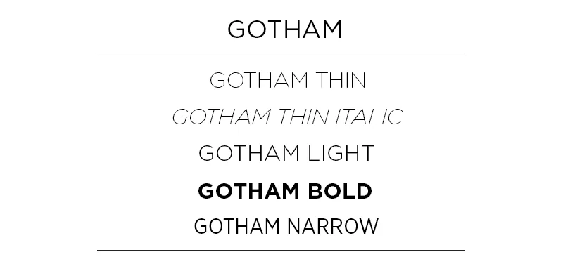
Let’s break it down:
Typeface: Gotham
Font: Gotham Narrow Light
Typeface: Chronicle Display
Font: Chronicle Display Light Italic
Today, many people use the terms typeface and font synonymously, but as a designer, knowing the difference is a huge help. For brands, it can be important to signify a specific font as representative of your brand instead of an entire typeface. For example, depending on the company, it may not be on-brand to use both a thin and a black font within a typeface. If you’re working with a designer, it will help them in creating on-brand material if you make this distinction!